Colour plays a significant role in design as it has the power to evoke emotions, convey messages, create visual hierarchy, and enhance user experience. Here are some key reasons why color is important in design:
1. Visual Appeal: Color has a direct impact on the visual appeal of a design. The right choice and combination of colors can attract attention, make a design visually appealing, and leave a lasting impression on the viewer.
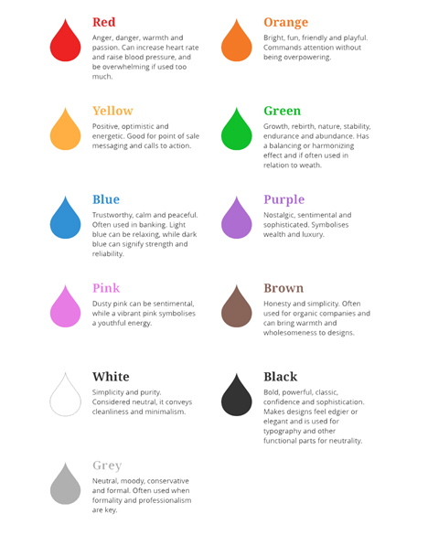
2. Emotional Response: Different colors evoke different emotions and moods. For example, warm colors like red and orange can create a sense of energy and excitement, while cool colors like blue and green can evoke feelings of calmness and relaxation. Designers can strategically use colors to create the desired emotional response in their audience.
3. Branding and Identity: Colors are an essential component of a brand's identity. Consistent use of color helps in brand recognition and differentiation. Many successful brands are instantly recognizable by their signature colors (e.g., Coca-Cola's red, McDonald's yellow and red). Color choices can reflect a brand's personality, values, and target audience.
4. Communication and Message: Colors can convey meaning and messages without using words. They can communicate ideas, concepts, and associations. For example, green is often associated with nature and sustainability, while black is associated with elegance and luxury. Color choices should align with the intended message and effectively communicate it to the audience.
5. Visual Hierarchy: Colors can be used to create visual hierarchy and guide the viewer's attention. Bright, saturated colors tend to stand out and can be used to draw attention to important elements. Subdued or contrasting colors can be employed to create depth, balance, and organization within a design.
6. Accessibility and Usability: Color is crucial for ensuring accessibility and usability in design. Considerations such as color contrast and color blindness should be taken into account to ensure that the design is readable and usable by everyone. Proper use of color can enhance readability, legibility, and overall user experience.
7. Cultural and Psychological Influence: Colors have cultural and psychological associations that can vary across different societies and individuals. Understanding the cultural and psychological implications of color can help designers tailor their choices to specific target audiences and create designs that resonate with them.
In summary, color is a powerful design element that can impact emotions, communicate messages, establish brand identity, guide attention, improve usability, and create a visually pleasing experience. It is essential for designers to carefully consider the role of color in their designs and make informed choices that align with their goals and target audience.
Frostbyte Team
Powered by WHMCompleteSolution
